

The Science of Picking the Perfect Paint Color - 3 Steps to Nailing Your Next Paint Project
If you’ve ever taken on the challenge of a DIY remodel, you know the overwhelming feeling of holding 20 different paint swatches and having no idea which direction to go. This is not an uncommon problem that can leave a homeowner feeling completely overwhelmed and bring an otherwise progressing remodel to a grinding halt. Although some paint experts will convince you that there is some magic formula in selecting the perfect pallet…trust me, it’s not that complicated. I’ve made my fair share of paint color blunders, but all failures are learning opportunities, so let me share a few of mine with you.
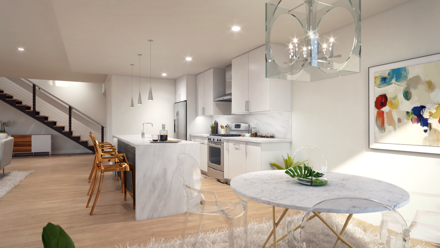
1. LESS IS MORE
Don’t attempt to design the entire house with paint alone. Good design happens in layers…paint, textures from fabrics, rugs and furniture, lighting, flooring, and accessories. These all play an integral part in a successful design project. You can’t paint your walls like a kaleidoscope, throw your old Ikea furniture in the room and call it good. Or worse yet, fail to take into account the materials that won’t be changing…you need to work around these elements of your home, not bulldoze over them.
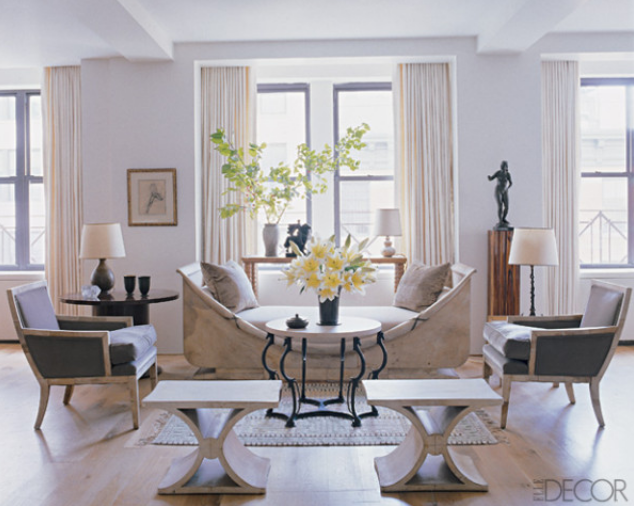
Everyone has a different approach to design, but this is mine. Paint is the canvas that the art of the room begins on…not where it ends. Don’t treat paint like the headliner…it should act as the passive supporter to the other players in the room. As much as bold accent colors can be sexy, in my opinion you need to keep it simple. When it comes to keeping it simple, classic neutrals always win the battle. They stand the test of time and offer the homeowner the ability to change the furniture, accessories, and art effortlessly as their tastes change.
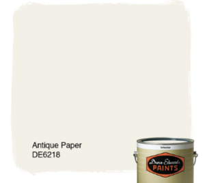
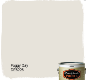
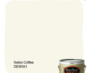
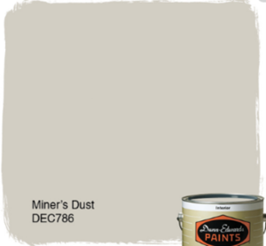
Here are a few of my favorite classic neutrals from Dunn Edwards…
2. WHAT TO DO ABOUT DOORS
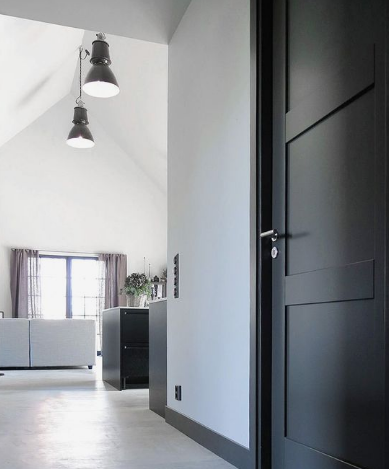
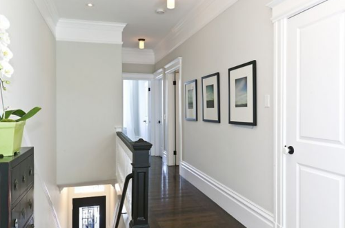
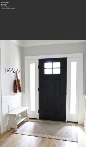
Way back in my less experienced youth, I experimented with paint colors on doors. I thought…Hmmm, ugly door? Paint it a fun color to disguise its unfortunate appearance! Wrong…this never goes well. An ugly door will be just as ugly with an off the wall paint color. As I mentioned before, classic prevails. My go to is white doors with white casing, leading into bright white baseboards. Boring as it sounds, it’s almost always the best option, and will have the fresh and clean transformation you are looking for. I will, on occasion opt for a saturated, dark grey. This looks stunning if you are looking for a more dramatic look…all the more reason to stick with a wall color that is easy breezy and goes with everything. Look at the two images of doors and trim below and see how keeping it classic can be both a bold and sustainable design choice.
3. TRY IT BEFORE YOU BUY IT
You know why looking at a 2”x 2” paint swatch is paralyzing? Because there is no way you’ll ever be able to see how the color will react to the lighting and unique architecture of your home looking at a postage stamp sized paint chip. There are two products where “chips” should never be used… diamonds and paint colors.
I have two steps to the ‘Try it before you buy it” philosophy. First, see if you’ll like how the color looks on a larger scale without getting your hands (and clothes, hair, etc.) dirty. A few smart paint manufacturers have added features to their websites that allow homeowners to upload a picture of their home, and virtually ‘paint’ it in any color they choose. Sherwin Williams calls theirs ColorSnap, and Dunn Edwards uses InstaColor. I’ve used both many times, and both serve as a quick and easy way to hone in on your perfect shade. Each tool allows you to save the color combos so you can purchase samples from the store once you’ve found a few options you like…which leads me to my next step…BUY A SAMPLE! Nothing aids in visualization better then painting a sizable swatch on the wall. I suggest at least a 3’x3’ area, painted in multiple locations of the home, this will allow you to see how the color reacts to lighting through out the day, and how it looks in different rooms. I suggest you narrow it down to (3) final contestants, as too many choices just create more questions. Visualize on your computer, then visualize on your walls.
CLASSIC NEUTRALS…
They win every time
My approach to picking the perfect shade is simple, classic, and timeless. Don’t fret that your space will be too “vanilla” (also a delicious color to consider) you can jazz up your home with art, window treatments, throw pillows, and maybe a furniture piece refinished in a bold pop of color. Remember, the paint color you choose should be the warm fuzzy background, allowing other elements to create the drama and interest in the room. Keep it simple, keep it classic, and paint like a pro!